Avoiding the Horseless Carriage
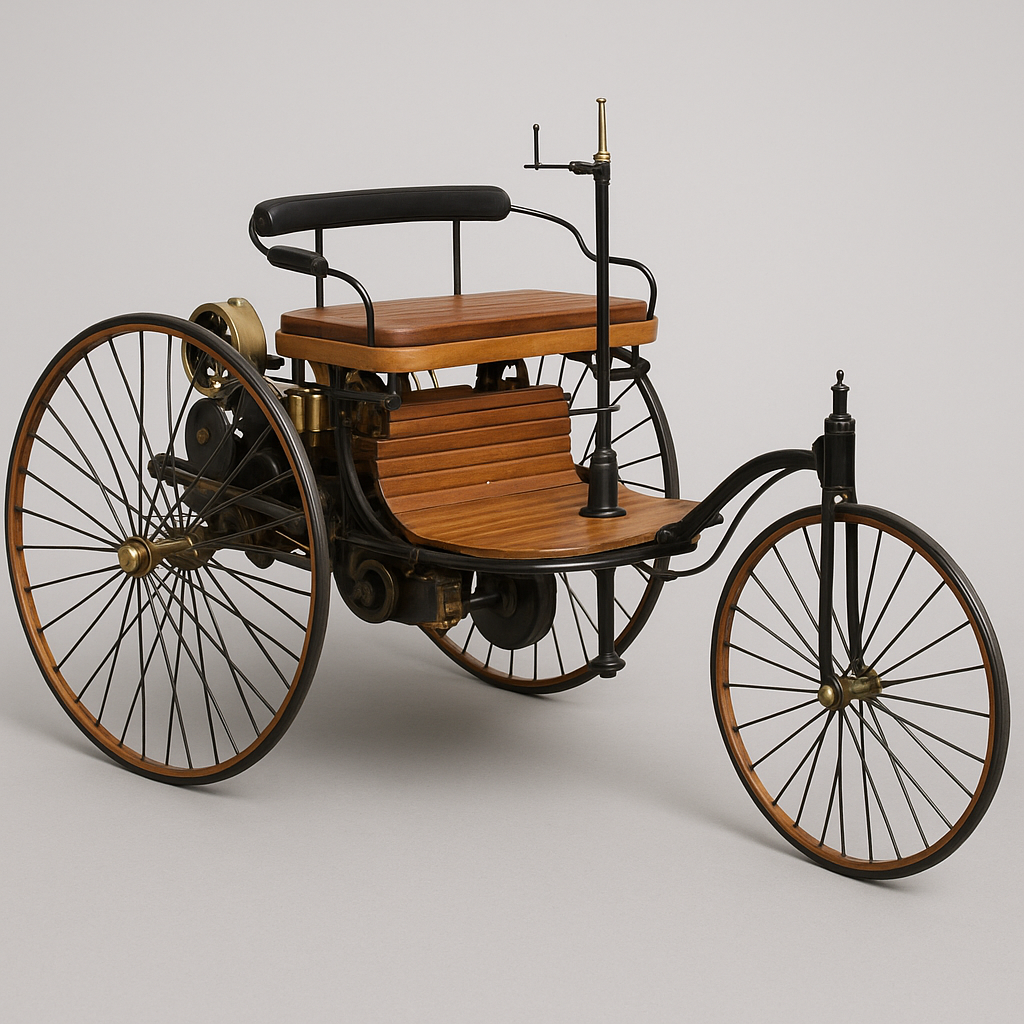
One common mistake with new technologies is to simply layer new features on top of existing ones, without rethinking the design from the ground up. Early automobiles, for example, closely resembled horse-drawn carriages. Part of this was due to cost and familiarity with existing manufacturing methods, but a deeper reason lies in human behavior: when new technologies emerge, it’s difficult to make a clean break in design and user experience.
We see this pattern repeatedly; calendar apps that mimic paper calendars on a screen, early mobile apps that looked like shrunken desktop versions, ignoring both the limitations and the new possibilities of phones. The same challenge applies today with AI-driven tools.
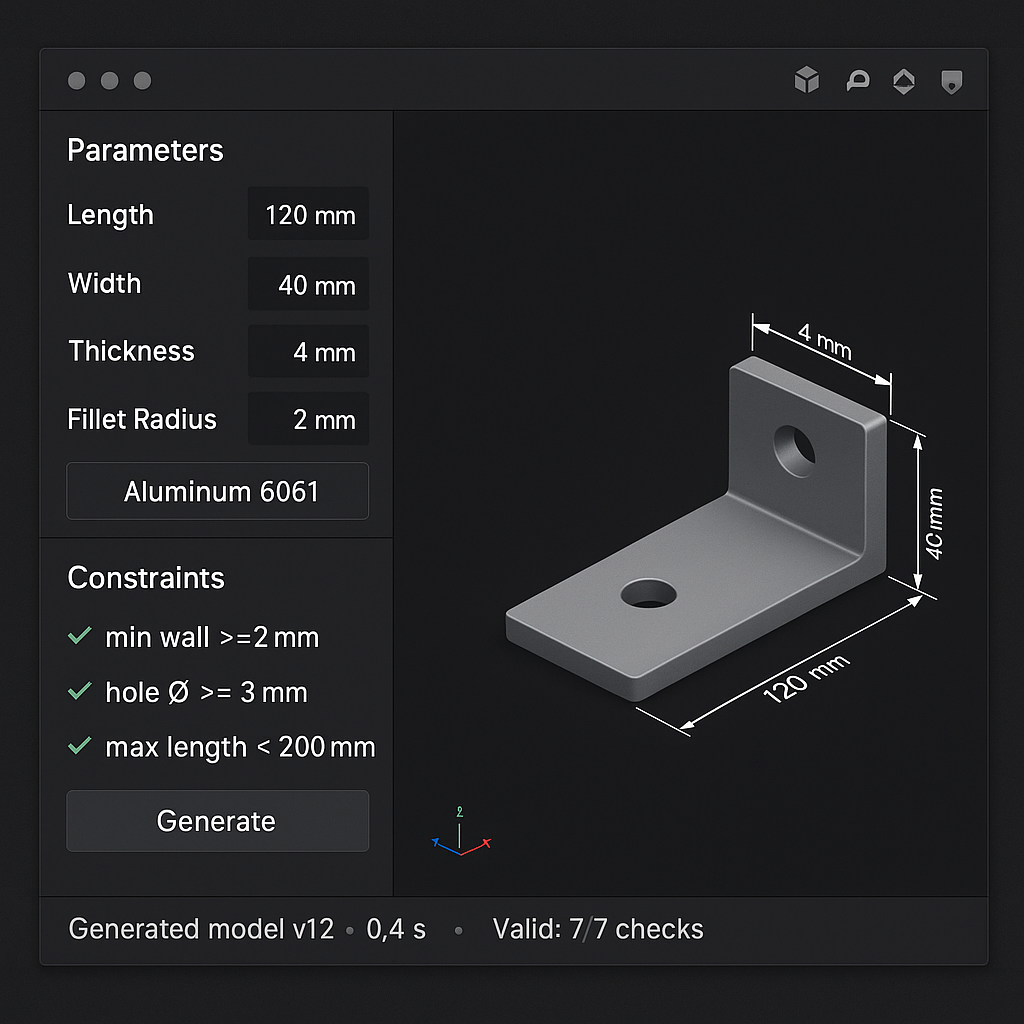
A 3D design tool built for automation and ease of use should not resemble current design software. The users are different, the goals are different, and the tools within the software are different. A new UX is essential.
So what should it look like?
No one can say for certain, but one thing is clear: copying existing design tools is the wrong approach. Instead, a few guiding principles might help:
- Reduce clutter. Current tools overwhelm with menus, toolbars, views, tables, and settings. In an automated world, much of that complexity disappears. The screen should reflect that.
- Embrace accessibility. Automation lowers the learning curve, inviting people who otherwise would never approach design software. That makes a clean, welcoming aesthetic and intuitive interaction design essential. Today’s engineering tools fail here.
- Experiment... carefully. Product design often relies on familiar interaction patterns to meet user expectations (e.g., touchscreens). But automation also creates room to introduce new concepts that weren’t possible before. The key is balance: push forward, but not so far that new users feel lost.
Finally, expect many iterations and inevitable trial and error; that’s the nature of building something new. What matters is keeping a clear focus on who the product is for and why it exists. Too often, teams lose sight of these fundamentals, and that’s where many products fail.


